Listen to the Podcast
16 August 2024 - Podcast #895 - (16:30)
It's Like NPR on the Web
If you find the information TechByter Worldwide provides useful or interesting, please consider a contribution.

If you find the information TechByter Worldwide provides useful or interesting, please consider a contribution.
There’s a certain amount of glee among Adobe haters, a crowd that is more vocal than I expected, because they think Canva will destroy their hated nemesis. Will it? Is this another story of David demolishing Goliath?
In a word: No.
If you’d like a somewhat more nuanced answer: Canva is likely to make some inroads into Adobe’s market share for individuals, those at small companies who are tasked with graphic design jobs but lack training, and some design teams at enterprises who are looking for ways to quickly and easily storyboard design projects that will then be developed in Adobe products. Canva has nothing to compete with Adobe’s video, audio, photography, or website design products.
That said: Limited Canva accounts are free, paid accounts are reasonably priced, Canva can be used as an app on the computer or online in a web browser, the interface makes it remarkably easy to use, and it offers non-designers the ability to create work that isn’t laughable.
Free accounts are given 5MB of online storage and access to a subset of Canva’s millions of photos. Paid accounts cost $120 per year and users have access to 100 million photos and are given 1TB of online storage, the ability to customize existing templates and save new designs as templates, sound effects, some powerful AI features, brand management tools, and access to support. I signed up for a paid account several years ago entirely for access to stock photos and occasionally use some of the other features, such as templates, the background removal tool, and asset management.
Although Canva has acquired Affinity’s Photo, Design, and Publisher apps for Windows, Mac, and IOS devices they don’t (yet) offer combined access. And although Canva is a subscription-based program, Canva pledges that Affinity apps will always be sold with perpetual licenses. To quote the company’s statement, “If we do offer a subscription, it will only ever be as an option alongside the perpetual model, for those who prefer it. This fits with enabling Canva users to start adopting Affinity. It could also allow us to offer Affinity users a way to scale their workflows using Canva as a platform to share and collaborate on their Affinity assets, if they choose to.” The future is open to many possibilities.
So it’s likely that the Canva/Affinity combination will attract some Adobe customers and Adobe should be concerned, but not panicked. Adobe’s wide range of products and its emphasis on continuously adding features make the company a formidable force for creatives who need access to multiple media types. Canva/Affinity is still essentially limited to photography, design, and basic publications.
But the threat is there. Quoting Canva’s statement again, “we’re committed to using our shared resources to continue expanding Affinity’s products through further investment in Affinity as a standalone product suite. We’re looking forward to accelerating the rollout of highly requested features such as variable font support, blend and width tools, auto object selection, multi-page spreads, epub export, and much more.”
Don’t expect Adobe’s demise, but do take a look at Canva/Affinity if you work in any design capacity. I’ve talked about Affinity’s apps previously, most recently in 2023, so now would be a good time to see what Canva offers.
Click any small image for a full-size view. To dismiss the larger image, press ESC or tap outside the image.
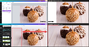 Canva offers Magic Expand, which is the equivalent of Adobe’s Generative Fill, and Adobe is currently far ahead of Canva. I started with a photo of three caramel apples that I wanted to expand to the left so that I could place text in the space. Adobe produced results much faster than Canva and the results were better. Canva’s fill didn’t include the texture of the wooden background; Adobe’s did. As a result, the manipulation was more obvious in the Canva image. It could be used, especially if the text placed on the top layer is sufficiently bulky, but there’s no question that Adobe wins and by a margin that’s made even larger by virtue of its faster response and the fact that Canva’s first attempt crashed.
Canva does offer some exceptional functionality, though, features designed to help people who aren’t graphic designers create workable images. And Canva includes a Design School website that won’t take the place of spending four years at the Columbus College of Art and Design, the Rhode Island School of Design, or Cooper Union, but it will give an attentive person enough information to use the tools with competence.
Sometimes competence is sufficient and good enough really is good enough.
 Canva’s Design School highlights a significant difference from Adobe. Canva approaches the process for those who need to learn the basics while Adobe’s videos tend to presume that the viewer already understands the knowledge behind the project and simply needs to know how to use the applications to achieve the desired results. Both approaches are exactly right for their intended audiences.
The developers have done a remarkable job in creating an installable app (left) and a web interface (right) that are virtually indistinguishable from each other, although occasionally I’ve had a small problem locating a function in the app that’s easily accessed on the web interface.
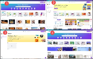 Overall, it’s a well-designed interface that’s easy for users to follow as they progress through the stages of a project. The (1) user’s home screen displays the most recent projects and suggests several activities for the user to try. There are direct links to documents, white board, presentations, social media, videos, print products, and websites. The (2) templates page is one of Canva’s most powerful features, offering starting points for various types of projects. The (3) branding page offers guidance for those who need to create a brand, with useful information about logos, typefaces, and colors. And the (4) website screen offers tools and information for setting up basic websites.
Earlier I mentioned that Canva can’t compete with Adobe for video and websites, and yet I’ve just described options that include video and website design. The difference is that Canva is best suited for short videos found on social media while Adobe’s video applications can be used to create full-length motion pictures that will be shown in theaters. Likewise, Canva is well suited to creating a basic informational website, while Adobe Dreamweaver is the tool needed to create interactive websites with hundreds of pages.
 I post a daily image on Facebook that illustrates the day’s theme according to Holidays Calendar (National Pepperoni Pizza Day, Global Handwashing Day, and International Cat Day, for example).
 So I would start by (1) searching for a pizza picture to use on National Pepperoni Pizza Day. The image I’ll select for this demonstration has more than pepperoni and it’s not the picture I used for that day’s image, but it allows me to illustrate some other features. Images shown with (2) crowns can be used only by paid subscribers. Those using free accounts will see other images. I (3) selected the image and (4) specified the size of the final illustration, 1200 × 628 pixels. The original image (5) doesn’t fit the format. Because there’s plenty of room at the top, I can enlarge the image proportionally to fill the left side of the screen. I need some space at the top for text, though, so I needed to use Magic Expand on the right side.
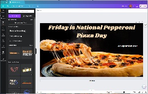 I completed the project by adding text at the top and the date. Magic Expand worked well here, but it is still considerably behind Adobe. Canva’s variety of typefaces, extensive as it is, still falls considerably short of what Adobe offers. Overall, though, the result is more than acceptable and even with the relatively slow Magic Expand process, the project was quick and easy.
Canva is already a well regarded application that’s a solid performer for its intended market. With the addition of Affinity to the family, it could begin to make some inroads into Adobe’s market share, but it’s definitely not the Adobe killer that some grumpy gurus seem to want it to be.
For more information about Canva, just visit the website, where you can sign up for a free account. Next, let’s take a look at Canva’s AI image generation compared to others in the market.
In addition to Magic Expand, which I just described, Canva has added Magic Media that can create an image based on the user’s description. Adobe uses Firefly to create images from text descriptions, and Microsoft Designer uses WALL-E.
Obviously there are potential dangers and misuses involved with this technology, but there’s no way to uninvent something. We might be better off without the internal combustion engine, atomic energy, and the internet, but we have them all and all we can do is concentrate on using them ethically and safely. And that’s as far as I’m going to go in that discussion.
Because we have artificial intelligence that can create images based on descriptions, let’s take a look at three of the available options. There are more than three, but I’ll limit the experiment to just Adobe Photoshop (using Firefly), Microsoft Designer (using WALL-E), and Canva.
The text provided to each application was the same: “Four cats sitting at a table in a home library, playing cards and drinking beer.”
Click any small image for a full-size view. To dismiss the larger image, press ESC or tap outside the image.
 Adobe Firefly has the largest number of selectable options in addition to the text the user provides. The first choice is content type, between art and photo. The user can then provide a reference image if desired and Firefly will try to capture the look and feel of the image. The final section offers choices from an effects panel, with sub-sections for movements, themes, techniques, effects (yes, that’s redundant), materials, and concepts. Each of the sub-sections has a variety of choices. Materials, for example, offers charcoal, claymation, fabric, fur, metal, origami, yarn, and several others. You’re not limited to a single choice. You might specify antique photo, chaotic, charcoal, and claymation; I don’t even want to see what the results of that might be.
Firefly’s realism is quite good. All four of the images are clearly AI creations, though, if only for the subject matter and not the photorealism of the four pictures.
 Microsoft Designer’s work may be slightly better than Firefly’s. The backgrounds aren’t as out of focus as in Firefly’s images, which improves realism. I particularly enjoyed two of the four images that include cats sitting atop the bookshelves. One of the images had added two people who are playing cards with the cats and both the hands and the paws are well rendered. Hands have been an ongoing problem when they’re included in many AI images.
 As the new kid on the AI block, Canva’s results are interesting. One of the images is an old-style drawing and other looks like a dated photograph, something from the mid-1900s or earlier. The other two have more modern looks, but the cats are too large in one photo and sitting on the floor instead of on chairs.
I wrote this summary at the end of July, but it won’t air until mid-August. By then everything could be different. AI image creation is evolving faster than anything I’ve seen in computer software. What’s been accomplished in the past year is certainly based on foundational work that began long ago, but the kinds of advances we’ve seen seem like they should have taken a decade or more, not just a few months.
In other words: By the time you read this, it may be entirely out of date.
TechByter Worldwide is no longer in production, but TechByter Notes is a series of brief, occasional, unscheduled, technology notes published via Substack. All TechByter Worldwide subscribers have been transferred to TechByter Notes. If you’re new here and you’d like to view the new service or subscribe to it, you can do that here: TechByter Notes.