Listen to the Podcast
1 Dec 2023 - Podcast #859 - (18:12)
It's Like NPR on the Web
If you find the information TechByter Worldwide provides useful or interesting, please consider a contribution.

If you find the information TechByter Worldwide provides useful or interesting, please consider a contribution.
Some folks just love to hate the Windows Start Menu. I’ve never hated it, not even the one that came with Windows 8, but I have often wished for capabilities that either weren’t present or were hidden several layers deep in a menu or Registry setting.
If you hate the Windows 11 Start Menu or if you wish it didn’t work the way it does, I have good news. In Windows 11 the Start Menu is far more configurable than it was in previous versions. If the customizations still aren’t enough for you, there’s Stardock’s Start11.
Stardock. Hmmm. Maybe that name sounds familiar. Perhaps you even remember the company from 30 years ago when it started making utilities to modify Windows. They started development for OS/2, but quickly switched to Windows when OS/2 failed. Since then, the company has produced games and a lot of utilities that are intended to modify the Windows user interface. We older folks may remember WindowBlinds that made it possible for Windows to look like OS/2 or a Mac or a NeXT computer.
Start11 fixes some problems with the Windows Start Menu and adds a lot of features. If you really loved the Windows 7 Start Menu, Start11 will emulate it. Or Windows 10’s Start Menu. There are four Windows 11 styles and each variant has what seems to be a never ending series of options and settings.
But before we go there, let’s see what you can do with the Windows 11 Start Menu.
I’ve described previously some of the changes I’ve made: Eliminating the Recommended section of the Start Menu, for example, carefully arranging pinned applications, and modifying the options that appear at the bottom of the menu. I’ve added pinned items to the Start Menu and removed pinned items that I don’t want. PowerToys Run lets me start applications without ever seeing the Start Menu and that’s just one of the reasons I think everyone should install PowerToys.
Between PowerToys Run and the Taskbar, the applications I need frequently are easily available. But the Taskbar is entirely too full now that it’s limited to a single deck of applications.
Starting with Windows 22H2, users could organize Start menu icons by placing them in folders. To create a folder in the Start Menu, drop one icon on top of another and then give the folder a name. To add others apps to the folder, just drop their icon on top of the folder.
I found the Recommendations section of the Start Menu to be annoying, so I removed it. By default, Microsoft omits too many option from the section at the bottom of the Start Menu go to Settings > Personalization > Start and click the Folders option. Then you can add Settings, File Explorer, Documents, Downloads, and other selections.
The Start Menu is now centered (like Apple does it) but you might not like this. Go to Settings > Personalization > Taskbar, and select the Taskbar behaviors option. Use the Taskbar alignment dropdown menu to change the icons from Center to Left. It’s no longer possible to place the Taskbar at the top, but you can at least control the Start Button.
Not enough? If you’re willing to spend $6 (or $13 if you want to install it on up to 5 computers), Stardock’s Start11 is what you’re looking for. If you’re not sure, there’s a 30-day free trial.
Click any small image for a full-size view. To dismiss the larger image, press ESC or tap outside the image.
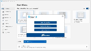 So I decided to take a look. Although I could have selected a Windows 7 Start Menu, or Modern Style, Windows 10, or Windows 11, I was most interested in the Windows App style, Windows Pro style, and Windows Launcher style. To give Start11 a trial run, you need to create an account, but no credit card information is needed.
 Once you’ve done that, you need to choose one of the styles. I started with Windows Launcher, but decided later that the Windows App style was more in line with my use cases.
 I compared the (1) default Windows Start Menu with Stardock’s (2) App Style, (3) Windows Pro, and (4) Windows Launcher options.
The format I selected currently has three menu panels and displays all installed apps on the right side of the Start Menu. I also make the Start Menu and the Taskbar transparent and selected a color for the Taskbar. When the computer is set up to change Desktop images frequently and the Taskbar color is selected automatically based on a color in the Desktop image, some of the icons can be hard to read.
 Among the options Start11 offers is the ability to change the typeface the application uses. There are also selectors that modify the Taskbar and many other parts of the interface. I selected the App Style menu because a full list of installed applications is included and the ability to organize the Start Menu and to use the Power Toys Run feature allowed me to limit the number of applications shown on the Taskbar.
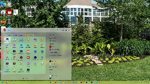 The user can also change the size of the Start11 menu, control which items appear at the top and whether the list of all applications is always present or appears only when requested. Additional menu pages can be added, but one of the features I like most is the ability to create tabbed menu areas on each page. These can be color coded, their transparency can be adjusted, and background textures can be added. I set the Start11 menu to be 125% of the normal size and added tabs to the main tab on the primary page for the applications I use the most, business applications, graphics and publishing, utilities, and the various Stardock applications.
Deciding whether Start11 was a worthwhile investment didn’t take long. For more information, see the Stardock website.
Besides Start11, Stardock offers other applications that modify the look and feel of the computer, including WindowBlinds 11, an updated version of the application offered 30 years ago. Many of the utilities are combined in a package called Object Desktop for $40 per year. Depending on how much customization you like, that could be $40 well spent. I plan to describe some of the other components in the Object Desktop package in coming weeks.
I mentioned the addition of Python in Excel a few weeks ago. That doesn’t mean you need to learn the basics of Python to use Excel, but Python makes Excel more powerful and you might even want to learn something about the popular programming language even if you never plan to use it in Excel.
Python can be used independently, it’s an easy language to get started with, and you may want to become familiar with it. Because it’s popular, you’ll find online learning resources, books, and reference materials to get the process started. One LinkedIn Learning session I looked at said Python is the most popular programming language on the planet. That’s a bit of hyperbole.
Click any small image for a full-size view. To dismiss the larger image, press ESC or tap outside the image.
 Statista says JavaScript is the most used programming language, followed by the combination of HTML and CSS (which many people do not accept as a programming language), and then Python. Despite the possible exaggeration, Python is certainly one of the top few programming languages.
It was created more than two decades ago and has largely replaced BASIC as a language that’s easy for beginners to learn. Python is free to download, install, and use on Linux, Windows, MacOS, MS-DOS, OS/2, BeOS, IBM i-series, and RISC OS computers.
If you already are familiar with one or more other programming languages, you’ll find similarities and differences. Python variables are weakly typed and this means that something you think is a number is actually a string and cannot be used for math functions. This trips up many new users, but it’s easily avoided and there are advantages to weak typing.
 You’ll also find different terms for familiar items. You may recognize a Python list as what many other languages call an array or a dictionary as what Perl calls a hash and Javascript calls an object. Overall the terminology can be mastered quickly.
I created a simple fortune cookie routine that calculates a random number between 1 and 5, then uses that to select one of five fortune messages. It also calculates a random number between 1 and 100, then displays it as the person’s lucky number.
Python’s syntax is as more like English than some languages, but one significant difference from other languages is that indents are important.
The first four lines of code are easy to read:
Then, each of the if fortuneNumber == (some number): lines inserts a pre-written fortune in the fortuneText container, based on the value of the random number. Only the indented line or lines below the test that matches the random number is run.
And finally, print (f"{fortuneText} Your lucky number is {luckyNumber}.") displays the message.
The TechByter Worldwide website suddenly became unresponsive on 8 November. Once I confirmed that the problem was not limited to my location, I reached out to the hosting service to find out what had gone wrong and what the estimated repair time was. It was an exercise in frustration.
The site has operated on Bluehost servers for two decades or more, from the time when it was owned by one guy and now through several ownership changes. Support and performance have ranged from excellent to lousy, with both hovering around “acceptable” most of the time.
Click any small image for a full-size view. To dismiss the larger image, press ESC or tap outside the image.
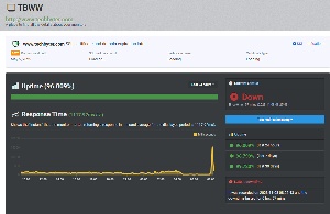
 Uptime Robot monitors my sites and lets me know when there’s a problem. Outages occur occasionally and they’re generally brief, so I ignore outage warnings and simply watch for follow-up messages that tell me service has been restored. By “ignore”, I mean that I wait 10 minutes or so to see if the problem resolves itself.
It didn’t on 8 November, so I tried opening the site with a browser and received a timeout response.
Next, I turned to the Down for Everyone or Just Me service and confirmed that the site was indeed down for everyone. That would mean either that there was a network problem near the hosting site in Utah or that there was a problem with the server itself.
I was able to confirm that the network was OK by connecting to the FTP service at the hosting site and by running traceroute. Both told me that there was no problem with the network, so I opened a chat session with Bluehost.
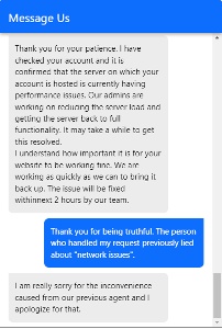 Businesses assign the lowest-paid technicians to handle initial request from clients, so you never know what you’re going to get. Some are very good. Others probably have trouble figuring out how to get out of bed in the morning. Unfortunately, I got one of the latter. He asked how I knew the site was unreachable. A couple of screen shots resolved that unnecessary question. Then he asked me to wait on hold for two to four minutes (which really turned out to be closer to ten minutes), then told me there was a network problem that would be fixed in “some time”. When I asked for a definition of “some time”, he said six hours.
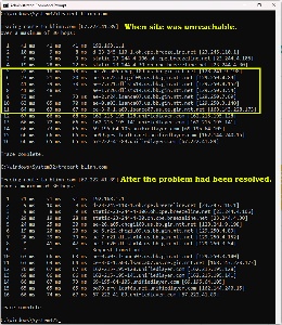 I already knew that I was being lied to because it was clearly a server issue, not a network issue. So I waited a few minutes, opened another chat session, and tried again. This time I got a technician who had a clue. After a brief pause, he told me the server that hosted my account was having a problem, technicians were working on it, and the estimated time to repair was less than two hours.
The site was operational again about an hour later.
Two points here: