Listen to the Podcast
5 May 2023 - Podcast #830 - (18:29)
It's Like NPR on the Web
If you find the information TechByter Worldwide provides useful or interesting, please consider a contribution.

If you find the information TechByter Worldwide provides useful or interesting, please consider a contribution.
Windows has a lot of settings. You might want to change one or more of the settings, but they're scattered all over the place and some require a Registry edit. The Ultimate Windows Tweaker from the Windows Club organizes a lot of tweaks for easy access.
Two weeks ago, I described how to fix oddball Windows annoyances, and discussed how to tame the Start Menu and Quick Settings a week before that. Although The Ultimate Windows Tweaker comes from the Windows Club, it's better to download it from OlderGeeks instead. That's because the Windows Club places links near the top of the page for other “utilities” instead of the file you want. That's something the OlderGeeks site never does. Instead, the link you want it always at the bottom of the page after a lengthy description about what the program does and donation requests. I prefer this approach to that used by so many other download sites that seem to want to trick visitors into installing something. If you prefer to download from the Windows Club website, though, you can do that here.
To set up God Mode (or whatever you'd like to call it), right-click the Desktop and choose New > Folder. Name the folder Whatever You Want.{ED7BA470-8E54-465E-825C-99712043E01C}. Spaces are OK in the text before the period, but everything after the period must be exactly as shown. When you double-click the new icon on your desktop, you'll be presented with dozens of options. Be careful, though, because making bad choices here will not have a good outcome. As a friend once told me A collision at sea can ruin your entire day. The same is true for botched Registry edits.
I said that Windows has a lot of settings and even a utility application that includes more than 200 Windows tweaks doesn't cover all the bases. Most of the tweaks aren't designed to fix annoyances, but only to provide users easy access to settings they may want to change. There are tweaks for privacy and security, performance, context menus, search, and more. When combined with God Mode and Power Toys, which I've described earlier, you'll be able to make Windows work the way you want it to. Each of these options take some time to research and learn, but making the computer work the way you want it to instead of modifying how you work with the computer is both satisfying and helpful.
The Ultimate Windows Tweaker has been around for several years and the new version five includes settings that are unique to Windows 11. The download is small, just a bit less than 220KB, which tells us that the application accomplishes few of the modifications itself but acts primarily as a menu system for changes that can be made.
So what's in there?
Click any small image for a full-size view. To dismiss the larger image, press ESC or tap outside the image.
 When you open the Ultimate Windows Tweaker, you'll see (1) a description of your computer and an offer to Run Assessment. If you select that option, it will run Microsoft's Windows Experience Index utility. The highest score possible is 9.9 and while the assessment is running, you'll see (2) a lot of activity in a command window. When the process ends, you can select (3) View Windows Experience Index to reveal (4) the summary. The main screen also includes options to run the System File Checker (SFC) and the Deployment Image Servicing Module (DISM), two utilities that Microsoft support almost always asks users to run when they request help with a problem.
 One example of the kind of change the Ultimate Windows Tweaker can make is displaying the Windows version number in the lower right corner of the screen. I like having the version number present because I can confirm at a glance that I'm running the latest version. This setting is on the Customization menu on the File Explorer tab, and that raises the question of how users find settings. It would be more than inefficient to have to look through every menu whenever you wanted to change something, so there's a Search for Tweaks option near the bottom of the menu. Choose that, type some text (example: “windows version”) and click Go to be taken to the appropriate location.

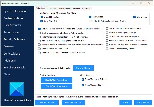 There are 10 menu items, some of which have multiple tabs. Customization has five tabs (Windows 11, Taskbar, File Explorer, Universal UI, and This PC). User Accounts has just one tab, but there are options to enable or disable the built-in Administrator account and to change User Account Control settings. The Performance menu also has just a single tab, but there are items to open the Services manager and the Resource Monitor. The Security and Privacy menu has tabs for Security and for Privacy. A menu for browsers works only with Microsoft Edge. The Context Menu screen has four tabs for various context menus. The Additional menu offers items that don't seem to fit elsewhere and an option for troubleshooting. The other two menu items are Search for Tweaks that I mentioned previously and About to display information about the utility itself.
Because some of the modifications involve Registry edits, the Ultimate Windows Tweaker reminds users that they should create a restore point and even includes the ability to create one from inside the utility. The Ultimate Windows Tweaker restarts the Windows Explorer after making changes and also recommends rebooting the system after exiting the utility.
Generally one keyboard has little to differentiate itself from any other, but that’s changing as I learned after installing the latest version of the Microsoft Ergonomic keyboard. There are lots of extra keys.
As a self-confessed keyboard slob, I have to replace keyboards more often than most people I know. Keyboards generally last no more than three or four years. I’ve been using a Fellowes Microban ergonomic keyboard for the past several years, but opted for a Microsoft model.
I’ve used ergonomic keyboards since they first became available and typing on a straight keyboard is difficult because I’ve become accustomed to the split keyboard design. It took a few days to become comfortable with an ergonomic keyboard, but the configuration reduces the danger of carpal tunnel syndrome.
I could have removed all the keys from the Fellowes keyboard, washed them, cleaned out the gunk in the keyboard chassis, and then replaced the keys. I’ve done this before and wrote about it in July 2008 and also in March 2020. The keyboard I cleaned in 2020 was a Fellowes unit, so it appears to have been in service longer than most of my keyboards.
Perhaps I should mention that this is a corded keyboard, which I prefer to wireless units even though I now use a wireless mouse. The Microsoft keyboard has several new keys and some key placements that my fingers aren’t yet happy with, and there are no feet near the back edge to rotate the computer forward. In fact, there’s a bracket that can be placed on the front of the keyboard to rotate it backward, and there’s a lip on the front of the keyboard that ranges from three to four inches across the width of the keyboard.
I’ve never understood why even most ergonomic keyboards had a mechanism to rotate the keyboard forward. This defeats much of the purpose of ergonomics, which has a goal of keeping the user’s wrists straight. Some keyboards with large front lips allow the user to remove them, but that isn’t the case for the new Microsoft ergonomic keyboard. It’s another way to help users keep their wrists straight.
Click any small image for a full-size view. To dismiss the larger image, press ESC or tap outside the image.
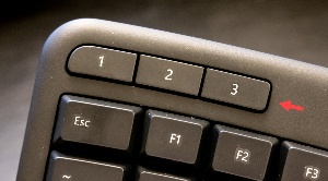 But what about those extra keys. In the upper left corner, three mystery keys are labeled 1, 2, and 3. Pressing them eliminates the mystery. 1 opens the first application on the task bar, 2 opens the second application on the task bar, and you can doubtless guess what 3 does. If you want those keys to do something else, they can be reprogrammed using the latest version of the Microsoft keyboard driver.
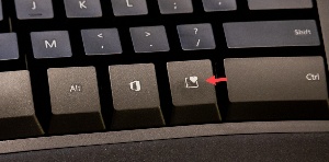 There are two mystery keys in the lower right corner of the main keyboard section. One with a box and another with a heart. The one with the box is where many keyboard manufacturers place a second Windows key. Apparently Microsoft has learned that users really don’t need a left Windows key and a right Windows key. Instead, this key opens Microsoft 365, the office suite, if it’s installed. Unlike some of the new keys, this one cannot be reprogrammed if you don’t like what it does. That leaves the heart key. Does pressing it send love to Microsoft? Sadly, no. But happily it opens the emoji picker so you can insert an emoji (😁), GIF, sticker, or something from the expanded Windows Clipboard.
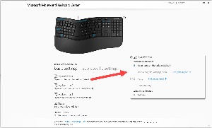 The Microsoft Mouse and Keyboard Center, which is available after you install the latest keyboard driver, allows the user to redefine most of the new keys. If I don’t want the “1” key to open the first item on the Task Bar, I could reprogram it to open any program, website, or file; run a macro; navigate through desktops or create a new desktop; snap a window left, right, up, or down; open the Action Center; perform a command on an audio or video track that’s playing; perform an action in an email application or browser; zoom in or out; perform document commands such as open, save, new, and print; open the File Explorer; act as a key combination; or lock the computer. I left a few of the possibilities out, but that’s most of them.
 The top of the keyboard has media control keys. These have become common on most keyboards in the past few years. The keys mute the speakers, increase or decrease volume, open the Microsoft Media Player (which I redefined to open Music Bee), play or pause, and select the previous or next track.
 Four more buttons are at the top right of the main keyboard. The one with a calculator icon opens the Calculator, which can be set up as a standard 4-function calculator or switched to scientific, graphing, programmer, or date calculation mode. It also has automatic conversion procedures for currency, volume, and length. The Calculator will be found on any Windows computer, but the keyboard makes it more useful—enough so that I may be able to stop using the calculator on the desk. I’ll come back to that in a moment.
The second button opens the Windows Snipping Tool. It would be helpful if this could be redefined to open Snagit or ShareX, but that’s not an option. The third button opens the Desktop and Task Switcher and the fourth button locks the computer.
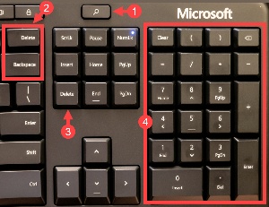 A key at the top of the screen (1) between the main keyboard and the calculator keypad has a magnifying glass icon. Pressing it opens a search box that then uses Microsoft’s Edge browser and Bing to find what you’re looking for. Microsoft has placed a second (2) Delete key above the backspace key and this is not helpful because it’s far too easy to press Delete instead of Backspace. There’s already a Delete key in the block of keys below the Search icon. The three columns of three rows of buttons is unusual and my fingers don’t like the layout, but it takes only a few days to retrain fingers.
The (4) calculator keypad includes parentheses. These are honored by the Calculator in Scientific mode. There are also dedicated clear, backspace, and decimal point buttons.
If you’re looking for a new keyboard, check the options. There are more choices today than ever before and some include options that can make your time at the computer easier and more productive.
Not every website it designed to print well. A more accurate statement might be that few websites are designed to print well. The TechByter website, for example, should display properly on computers, tablets, and phones, but not so well when it’s printed.
There’s a way to fix the problem, and it’s both easy and free.
Click any small image for a full-size view. To dismiss the larger image, press ESC or tap outside the image.
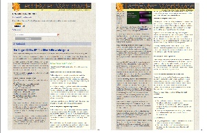 The 24 March 2023 edition about the dangers of artificial intelligence has a length sidebar that breaks across several screens. When printed, the website also gets the banner at the top of every page and some text is covered by the banner.
It’s easy enough to use a screen capture function and then to print the image, or to use the mouse to select some text, copy it, and then paste it into a Word document.
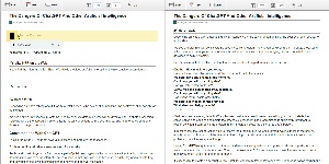 Pasting the URL into the PrintFriendly website or installing the PrintFriendly browser extension eliminates the problem. PrintFriendly represents the page in sections that can be eliminated in the print version. When printing the page (left), I might want to eliminate the podcast player, the subscription link, and the donation request. Because the sidebar starts after the second paragraph of the main article, I might want to eliminate that, too, and the resulting print output has just the main text (right).
Using the browser plugin makes the process even easier. Instead of needing to copy the URL and paste it in on the PrintFriendly website, just click the PrintFriendly icon and the modified page appears atop the page. You can then click items to remove. The utility uses the HTML structure to make components selectable.
Images can be deleted and text can be removed one paragraph at a time. Users can also modify linespacing and change the size of images. After deleting the items you don’t want to print, the output options are print, PDF, and email. If you choose email, the result may not be what you expect. A message will be sent using SendGrid, but the message includes only the title and first paragraph with a link back to the article. If you want to send an email copy of an article with the extraneous materials removed, create a PDF. When choosing the PDF option, you can set the page to US letter size or the A4 size used in most other countries.
This is a most useful utility on newspaper websites where articles often include images that are links to related articles.
Another in the occasional series of scams perpetrated by idiots.
