Listen to the Podcast
14 April 2023 - Podcast #827 - (20:05)
It's Like NPR on the Web
If you find the information TechByter Worldwide provides useful or interesting, please consider a contribution.

If you find the information TechByter Worldwide provides useful or interesting, please consider a contribution.
Do you like the way the Windows 11 Start Menu works? What about Quick Settings? It’s likely that some things you’d like to see there are missing and other things that you never use are present. It’s an easy fix.
I read and hear a lot of complaints about the way Microsoft has chosen to do things and what surprises me is that many of the irritations people complain about are easily changed. I’ll describe a couple of things I’ve done to make the computer function the way I want it to, but a quick Google or DuckDuckGo search will probably describe a fix if I don’t mention the “feature” that annoys you.
If you’re wondering why Microsoft doesn’t make Windows work exactly the way you think it should, consider this: Does everything work exactly the way you think it should when you buy a car, move into a new house or apartment, or replace an old appliance with a new one. There’s probably something that you want to change with the new car, house, apartment, or appliance. Do you blame the manufacturer for getting things wrong or do you make changes? I’m assuming that you make changes. So why should a computer be any different.
The computer arrives with settings designed for the average user, but the average user doesn’t exist. The BBC program QI once described how an organization designed a piece of wearable equipment for an average employee. The suit designed for the average employee fit nobody well, and so it is with the average Windows settings.
Let’s look at three of the most common areas of complaint and confusion: Apps that start with Windows, the Start Menu, and Quick Settings. I don’t remember when Quick Settings was introduced and couldn’t find a definitive answer. The feature may have been present in Windows 8 or 8.1. It’s definitely present in Windows 10 and it actually works in Windows 11.
I reinstalled Windows 11 in March because the system was exhibiting some strange behavior. The underlying problems included non-Microsoft applications. Because I use the primary computer for testing and evaluation, a lot of software comes and goes. But there may also be some hardware issues. That remains undetermined. In any event, reinstalling the operating system and reinstalling applications instead of restoring them from backup seemed the best option. This meant that I got to see a computer with an operating system and interface designed for the “average user”.
Depending on the computer manufacturer and the computer model, applications that you don’t want may start with the computer and some programs that you install may schedule themselves to start with Windows without requesting permission. A new option in Settings makes this an easy fix.
Click any small image for a full-size view. To dismiss the larger image, press ESC or tap outside the image.
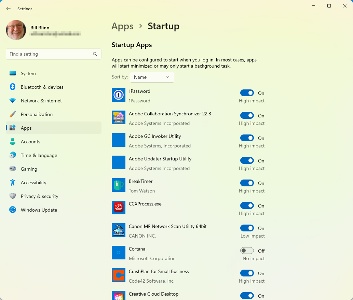 Start Settings, click the Apps tab, and then choose Startup at the bottom of the list. Every application that starts with Windows will be listed here. To keep an application from starting, find it in the list and then flip the toggle switch to off. Either Microsoft or Lenovo thought that Microsoft Teams should run at Startup. I do not use Microsoft Teams, so I turned it off. Lenovo includes Glance by Mirametrix, an application that I might find useful if I didn’t already have applications that do what it does. I turned that one off, too.
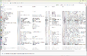 This is a useful function because it can set applications that start with Windows, but it can’t specify when an application starts. A better option is the free Startup Delayer from R2 Studios. In addition to specifying which application will start with Windows, it controls when applications can start. By default, Startup Delayer sets a blend about halfway between fast and smooth. That works for most people, but user can disable or delete applications that they don’t want to start with Windows. Being able to choose when an application starts is helpful when a program is slow to start and delays other applications. If there’s an application like that on your computer, Startup Delayer can set it to start automatically based on CPU or disk activity, or it can be delayed a specific number of seconds or minutes.
The Start Menu has been a mess for a while, starting with the disaster that was Windows 8. Tiles could be different sizes and sometimes they seemed to move around on their own. That nonsense was discarded in Windows 10, but Windows 11 is even better — or maybe less bad because there are still improvements to be made.
 By default the Start Menu has three rows of applications that include items I might not want such as (1) XBox and Solitaire, three rows of (2) “recommendations”, and only the Power button at the bottom. I want the recommendations to go away. I want more rows of applications, and I’d really like to have more options at the bottom.
 To fix this problem, I started by right-clicking in a blank area of the Start Menu and then clicking Start Settings and selected the (1) More Pins option instead of the default option. This adds one more row of app icons to the menu. I also turned off (2) Show recently added apps, Show most used apps, and Show recently opened items in Start, Jump Lists, and File Explorer. This should allow at least one more row of app icons, but it doesn’t.
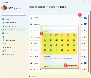 Clicking the Folders selector adds the finishing touches to the Start Menu. Although I’d prefer to have Settings on the Task Bar, it’s now limited to a single row of icons. On the Folders panel, (1) I turn on icons for Settings, the File Explorer, and Network. These appear (2) adjacent to the Power button. The next step will involve modifying (3) the icons in the Start Menu’s upper section.
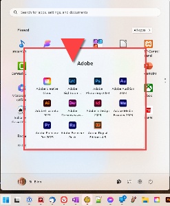 Icons on the Start menu can be moved around and dragging one icon on top of another creates a folder. Then it’s possible to drag additional icons into the folder and arrange them in the order the user prefers. For example, a folder could contain the most frequently used Adobe applications.
The Start Menu itself gains additional panels when one is full.
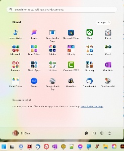 When I finished, the Start menu had just a single panel with individual icons for a few applications such as StreamWriter, Beeper, and Timeslips. The other icons were all groups of icons for Microsoft, Adobe, Affinity, video players, browsers, utilities, and more.
I still have the applications I use most frequently on the Task Bar. These include 1Password, Q-Dir, Thunderbird, Vivaldi, OneNote, UltraEdit Studio, Lightroom Classic and Photoshop, Word and Excel, and a few other applications.
 The final section that may need some modification is Quick Settings, which lives on the right side of the Task Bar, (1) immediately left of the clock. Clicking the area on the Task Bar opens Quick Settings and clicking the (2) pencil icon opens Edit mode.
My primary computer has a battery, but it’s always connected to AC power so I don’t need the battery setting, so I can (3) click the pin icon to remove it. There’s one icon I’d like to add, and there’s an (4) option for that. Even though the computer is connected via Ethernet cable, it seemed like a good idea to activate the Wi-Fi icon in case I ever need to use it without the wire. The Quick Settings area also provides quick access to the full (5) Settings function.
So if there’s something that annoys you about how Windows works, see what DuckDuckGo or Google can show to help you find the solution.
Long ago, but still in this galaxy, the accepted way to make a slow computer faster involved adding RAM. Then the best option involved replacing a mechanical disk drive with a solid-state drive. Now that many computers have SSDs, we're back to adding RAM.
That happened to me recently. The computer wasn't slow. After all, it has an Intel i9 processor, a solid state boot drive, fast hard drives for data, and what I thought was enough memory. Although the computer had 32GB of RAM, there were still times when some operations were sluggish.
Click any small image for a full-size view. To dismiss the larger image, press ESC or tap outside the image.
 A large part of the problem was obviously the web browser, Vivaldi. Sometimes I have a lot of sites open simultaneously and sometimes a site has a lot of graphics. For example, one site with several hundred typefaces, each represented by an image to show what it looked like. Vivaldi was using more than 2.3GB of RAM in a system with 16GB. The dozen or so other applications and 184 background processes consumed nearly 60% of the system's memory.
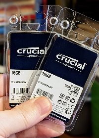 Adding RAM seemed like a good way to boost performance. I wanted to add another 32GB of RAM using two 16GB modules.
Desktop computers make the process easy because the primary component in the case is air. Gaining access to the memory slots is easy. The process is more complicated in notebook systems, and that's what I was dealing with. Two memory slots were on the bottom of the computer, but both of those were filled and the other two slots were on the top of the computer, below the keyboard.
To get there, I had to loosen the screw that holds an access panel in place, open the panel on the bottom of the computer, loosen two screws, turn the computer back over, open the screen, unplug two ribbon cables, remove the keyboard, remove three tiny screws, slide an access plate about one centimeter, and remove the plate. The two memory slots were there.
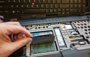 Installing the RAM modules was easy, and then I had to reverse the process: Replace the metal plate, slide it into place, insert and tighten the three tiny screws (taking care not to drop them into the computer), re-attach two ribbon cables, slide the keyboard back into place, close the cover, turn the computer over, tighten two screws, replace the access panel, and tighten its screw.
 After reconnecting power and network cables, plugging in a USB cable and an HDMI cable, and plugging in two Thunderbolt 4 cables, I turned the computer back on.
When a computer boots after certain hardware changes, the process takes a long time. In this case, about five minutes. Long enough for me to begin to think that something might have gone wrong even though I had carefully checked my work at every step.
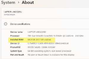
 The first stop after rebooting the computer was Settings > System > About where I found that the computer now had 64GB of RAM. Better still, the activities that had been sluggish when the computer had 32GB of RAM were no longer sluggish.
Truth in tech writing: You’ll note that the “before” image on the left shows 48GB of RAM, not 32GB. That’s because I had first decided to add only 16GB, which increased the memory to 48MB. That was adequate, but it seemed reasonable to use the one remaining slot to take the memory up to 64GB. And yes, that means I performed the actions described to gain access to the memory slots under the keyboard twice. The extra effort was worth it.
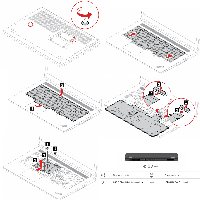 My point today is that many bits of computer maintenance are well within the capabilities of most people. The Crucial website offers a system analysis function that reveals how much RAM is in the computer and which slots are open. With the memory modules in hand, I needed only the instructions for adding RAM from the computer's manual. Lenovo provides well written instructions and, after reading the instructions, I printed copies of some of the illustrations so that I wouldn't get lost along the way.
Anyone who can read and follow instructions should be able to add RAM, swap the computer's boot drive, and master many other basic maintenance tasks. Computer maintenance is a lot like working on any other expensive, small device: Read the instructions twice; if you don't have printed instructions, make your own; refer to the instructions while you're working; and never force anything.
Where would you find the most tech-savvy old people? The question not asked is why you might want to do that, and there’s another question that should be asked.
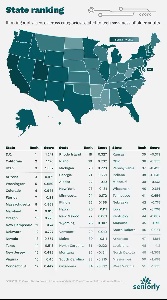 According to the Seniorly Resource Center, the most tech-savvy oldsters are likely to be in the District of Columbia, California, and Utah. The report says the least-savvy seniors are found in North Dakota, Mississippi, and (at the bottom of the list) West Virginia. Why would you want to find the most tech-savvy seniors? Maybe you wouldn’t. I probably wouldn’t, either, but I found the report interesting because I’m squarely in the target group and Ohio is in 36th place, near the top of the bottom third.
 Before looking further, note that statewide rankings are probably silly and not worth thinking about. West Virginia doubtless has some seniors who know far more about high tech than some seniors in DC. As is the case with so many things, the outcomes probably are more a factor of socio-economic factors than location in any specific state. In other words, those areas where incomes are higher are probably more likely to have a higher percentage of aging geeks. That’s the question that should have been asked.
The report says that the pandemic pushed some older people into positions where they began to see tech in a positive light, but many still lack confidence or aren’t quite sure how to use devices they own. That information came from an AARP survey. Nationally 15% of seniors lack access to technology at home. Other barriers exist. The Seniorly Resource Center says these range from lack of knowledge and cost to not understanding the benefits and the inability to deal with installation.
Spending on devices is, as you may already expect, higher in states with a more tech-savvy senior population. Those in DC spend the most, around $700. Utah is second at $603 and both Texas and Nevada come in around $500. This compares to West Virginia’s average of $83, Vermont ($113) and Maine ($162).
The digital divide is real. The report says that although seniors are increasingly using technology they’re not fully on board across the country. The full report is on the Seniorly Resource Center website.
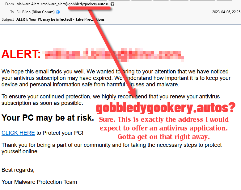
Another in the occasional series of scams perpetrated by idiots.
