Listen to the Podcast
2 September 2022 - Podcast #808 - (19:35)
It's Like NPR on the Web
If you find the information TechByter Worldwide provides useful or interesting, please consider a contribution.

If you find the information TechByter Worldwide provides useful or interesting, please consider a contribution.
Thunderbird users who have set the email application to install updates automatically may have noticed some changes recently. These aren't revolutionary changes, but they give Thunderbird a more modern interface and add useful features. Not to sound like an old TV commercial, but the new Thunderbird has been completely restyled for 2022!
Click any small image for a full-size view. To dismiss the larger image, press ESC or tap outside the image.
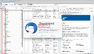 The first change I noticed was colorful icons beside folder names. This might seem like an insignificant change, but user experience designers know that color can impart useful information. Previously the icons were monochrome, but the colors communicate faster.
If you're a Thunderbird user, check to see which version you're running by selecting Help, About Thunderbird from the menu. Any number higher than 102 will indicate that you're using the most recent release. When the current version is not the latest version, Thunderbird will offer to install the current version.
Some people use Outlook because it comes with Microsoft 365 or because it has a built-in calendar or because it looks more up to date than competing email programs. Thunderbird 102 goes a long way to address those issues. The look is more modern, I've always considered Thunderbird easier to set up and maintain than Outlook, and now it can easily by connected to Google Calendar.
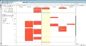 There have been extensions that tried to connect Thunderbird to Google Calendar, but they were difficult to set up, hard to maintain, and didn't work very well. Syncing the Google Calendar with Thunderbird is built in to Thunderbird now and it's dead simple. So simple, that I initially failed to set it up because I tried to make the process harder.
Start with File, New, Calendar and select On the Network. On the next panel, provide your Google user name (your.name@google.com, for example). Thunderbird will automatically add "google.com" to the location field. Leave this alone. Make sure Offline Support is selected, and click Find Calendars. You'll be asked to provide your Google user name and password. If you've set up 2-factor authentication, you'll be asked to confirm your request.
And that's it. The calendar displayed in Thunderbird will exactly match your Google Calendar and full two-way synchronization is included. Any changes made in one location will be reflected in the other. You can choose to have Thunderbird display alerts or silence them.
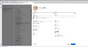 The Address Book has also been given a complete makeover and entries can be for individuals with one or more email addresses or for multiple individuals in groups. Several people I know have more than one email address, and all of these can be added to a single entry so I can select which email address to use when I compose a message. I also have a "Family History" email group that's composed of several family members who participate in a genealogy project. Selecting the group sends a single message to everyone in the group.
 I like the overall look of the new Thunderbird. (1) Icons on the left edge of the application open tabs for email, contacts, calendar, tasks, and chat. Once you've opened a tab, the tab will open each time Thunderbird starts up. My preference is to have Mail, Calendar, and Address Book tabs open by default. (2) I mentioned the colorful icons previously and it surprises even me how much more up-to-date Thunderbird appears after this small change.
Choosing the Vertical view causes any (3) selected message to appear in (4) a panel at the right of the message list. If you've linked a calendar to Thunderbird and enabled the Today Pane, (5) calendar entries will appear in a column at the right. The (6) tabs at the top can be arranged in any order the user prefers.
By default, Thunderbird shows basic information about a message's source, but activating View, Headers, All provides more detailed information. I like being able to see the full routing headers, too. This information can be helpful when you're trying to determine whether a message is legitimate or a fake. Outlook makes it difficult to see even the most basic routing information. Thunderbird makes it easy to see the detailed routing information and the entire source code of the message. Select a message and choose View, Message Source from the menu or press Ctrl-U. This feature alone could make Thunderbird my favorite email client.
The Add-Ons and Themes option on the Tools menu has three tabs: Ones for extensions that Mozilla recommends, another for all extensions, and a third where the user can specify a theme.
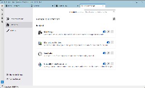 Four extensions are essential to the way I use Thunderbird.
Message filters aren't new to this version of Thunderbird, but I consider them essential because the filters can apply to both outbound and inbound messages.
Thunderbird is far easier to set up than Outlook is. After the Mail Account Setup Wizard accepts your name, email address, and password, it attempts to determine the appropriate settings for the account. If you have an uncommonly complex arrangement, such as using one service for inbound messages and another for outbound messages, you'll need to perform some manual configurations — but if you have such an arrangement, you doubtless know what the settings should be.
The search function in Thunderbird has been improved. It contains filtering and timeline tools to locate the exact message you want. Thunderbird also indexes emails and chat conversations for faster searching. Search results are displayed in a tab so you can easily switch between the results and other messages.
Speaking of Chat: Thunderbird can interface with IRC, Matrix, XMPP, and Odnoklasskiki chat servers. But there's more. If you belong to any newsgroups, you can add them to Thunderbird. Blogs and RSS news feeds are also supported.
Thunderbird automatically blocks remote images in email messages as a security feature. Users can whitelist specific senders so that images will be displayed. Phishing protection is included. You'll see a warning if Thunderbird thinks you you've received a scam message and, if you click a link that appears to be taking you to a different website than the one indicated by the displayed URL, you'll see another alert.
 Thunderbird is no longer almost the best email client.
Thunderbird for 2022 brings the email application fully into the current decade with an improved user interface, excellent organizational and security tools, a fully integrated calendar, and an excellent address book. Support for newsgroups, chat, and RSS feeds make it even better. If you're still using any other email application, maybe it's time to take a look at Thunderbird.
Additional details are available on the Mozilla Thunderbird website.
The cat rating scale ranges from 0 cats (worst) to
5 cats (best).
The rate of change exceeds the rate of progress. Maybe it's been that way for a while now, but change is constant and progress seems to be questionable. Take Facebook, for example: Eight years ago, 71% of teens used Facebook. Today's teens are abandoning Facebook and only 32% use it. Instead, teens now use YouTube, TicTok, Instagram, and Snapchat.
We've been through this before, more than once. A decade or two ago, teens abandoned email, calling it instant messaging for old people. For the same thing to be happening to Facebook must be worrisome for Mark Zuckerberg and Facebook's board of directors. It happened even earlier with newspapers. Few people under 60 read the printed version of a newspaper and that number approaches zero for teens. The only reason I won't claim that it is zero is the possibility that some teenager somewhere on the planet actually does read a newspaper.
If you have as much trouble as I do with the concept, maybe reviewing the generations would be helpful here.
The names of these generations make every bit as much sense as Windows version names: Windows, Windows 2, Windows 3, NT, 95, 98, 98 Second Edition, 2000, Me, XP, Vista, 7, 8, (skip 9), 10 (which was supposed to be the "last" Windows edition), 11, and 12 is on the way.
In terms of technology:
The Pew Research Center says teens in the US are abandoning Facebook in favor of TikTok, Instagram, and Snapchat.
Click any small image for a full-size view. To dismiss the larger image, press ESC or tap outside the image.
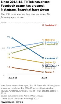 The report says Gen Z internet use is up but Facebook usage is rapidly declining: Only 32% of teens aged 13-17 use Facebook at all. In 2015 that number was 71%.
As a bona fide member of the Boomers clan, I can confirm that I spend a significant amount of time on Facebook to keep up with friends and family and for information from organizations. Teens may associate Facebook with their parents — something the old folks use. Anyone who has ever been a teenager knows that you probably won't want to use what your parents use.
Documents leaked by Facebook whistleblower Frances Haugen show that Facebook is aware of the challenge. Internal research last year revealed that teen usage had dropped 13% since 2019 and projected that the decline would be 45% by 2024.
Pew's figures put TikTok usage at 67% among teens, Instagram at 62%, and Snapchat at 59%. Fortunately for Zuckerberg and company, Instagram is part of Meta. But ominously TikTok has gone from nothing to 67% in less than five years. And then there's YouTube: 95% of teens use YouTube for videos and for music.
Pew's research surveyed 1316 teens and included additional questions about how often they use the individual apps. Nearly one fifth of the respondents said that they use TikTok almost constantly. Just 2% said that about Facebook.
Kindle ebook readers are handy. They're reasonably priced. They work well in both bright and dark areas. But they don't work with ebooks in EPUB format. At least they haven't until now.
Amazon uses a proprietary format, AZW3, for kindle books. Some libraries can provide ebooks in Kindle's format, but EPUB is more common and there are thousands and thousands of copyright-free books available in EPUB format. These couldn't be used on Kindle readers.
That will change later this year when the Kindle Documents Service will convert EPUB files to AZW3. Support will be dropped for old AZW files and MOBI files. Any books you have in those formats will still work, but you won't be able to add any new ones.
So at long last Amazon's book readers will be on par with those from other vendors in being able to use the most common ebook format.
This feature isn't entirely new. EPUB files could be converted to other formats by applications such as Calibre, but the resulting files still had to be transferred manually to the Kindle device. Now that will all happen automatically.
For now, I'll stick with reader applications on my tablet. Using a device I already own means having one fewer item around the house. I bought one of the first Kindle readers prior to 2010 and loved it. Long battery life, great monochrome display — but the closed, proprietary system was an annoyance.
If you already own a reader from Barnes and Noble or Kobo — or if you use a smart phone or a tablet to read ebooks — there's no compelling reason to buy a Kindle based on its new ability. But at least it's nice to see that Amazon has finally seen the light.